Top 5 Best and Worst NBA Cup Courts of 2026
The NBA Cup kicked off on October 30, with group play stretching through November and the tournament's knockout stages arriving in early December. Unlike last year, when the Knicks took home both the NBA Cup and the NBA championship, this season’s outcomes remain uncertain but the courts are already turning heads.
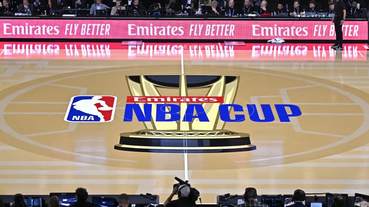
Each NBA arena features a fresh design for the NBA Cup games, blending team colors with the league's gold trophy motif. Some courts shine visually while others fall flat. Here’s a look at five courts that stand out positively and five that don’t quite hit the mark.
Top 5 NBA Cup Courts of 2026
- Cavaliers: Cleveland’s court boasts a rich wine-and-gold palette, with gold baselines and sidelines complementing a deep red playing surface. The gold trophy images fit naturally here, creating a refined look that feels like a step above.
- Nuggets: Denver’s bold dark red floor contrasts strikingly with their blue logo at center court and the yellow perimeter. This tri-color mix makes their court uniquely vibrant compared to others.
- Timberwolves: Gray plays a significant role in Minnesota’s updated colors, and it works well here. The gray isn’t overpowering, and the blue surrounding the court adds a nice pop along with their fresh logo at midcourt.
- Mavericks: Dallas picked a bright blue-and-black combination over dull gray. The trophy art stands out vividly against this backdrop, giving the Mavericks a lively appearance during NBA Cup nights.
- Jazz: Utah’s purple court is unmatched in the league, paired with sky blue edges that echo their jerseys perfectly. They don’t need flashy designs to impress, as their unique color scheme speaks for itself.
5 Least Impressive NBA Cup Courts in 2026
- Warriors: Golden State’s court leans heavily on gray, a color not typical for the team. Given their usual vibrant aesthetic, relying on gray feels out of place and dull.
- Lakers: The Lakers’ court is mostly highlighter yellow with black lines, with only a tiny purple logo at center. It misses the warmer yellow tones popularized in the Kobe Bryant era, and the lack of purple around the edges is noticeable.
- Grizzlies: Memphis chose a dark gray floor that doesn’t complement their subtle blue hues. A lighter shade or any throwback colors could have been more dynamic choices.
- 76ers: Philadelphia’s court uses a blue-on-blue scheme with a simple "76" at midcourt. Navy blue isn’t central to their identity, and the monotone palette keeps the court from standing out despite their patriotic imagery options.
- Spurs: San Antonio’s black-on-black court features a very dark gray that barely contrasts with the surrounding black. They missed an opportunity to use their vibrant Fiesta colors, which would have added some needed energy.
Each NBA Cup court tries to reflect its team’s personality while incorporating the tournament’s gold trophies. Some succeed brilliantly, others less so, but all add variety to the early-season competition.